 Mental Bound
D&T Vrachion — Bilingual construction company site
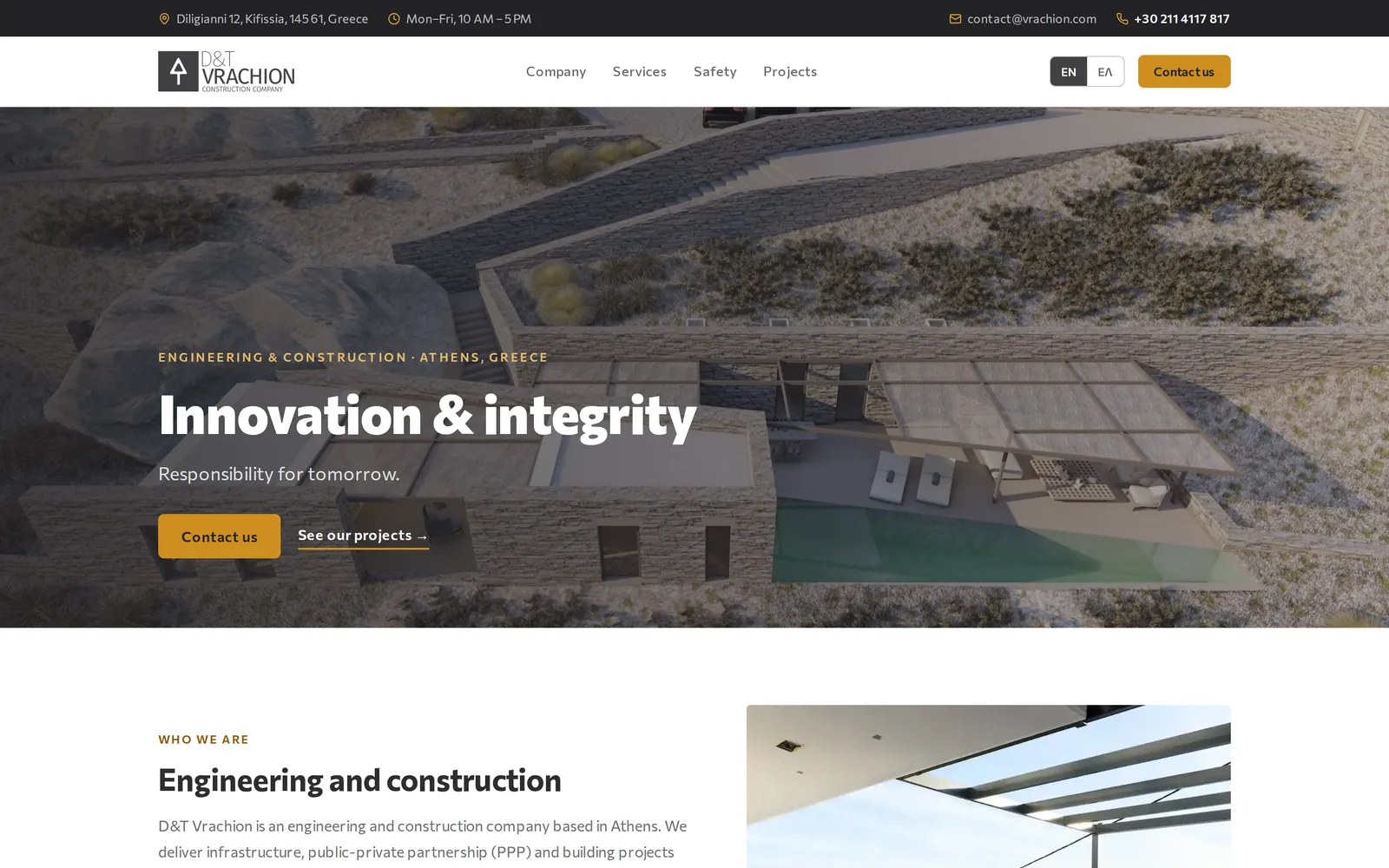
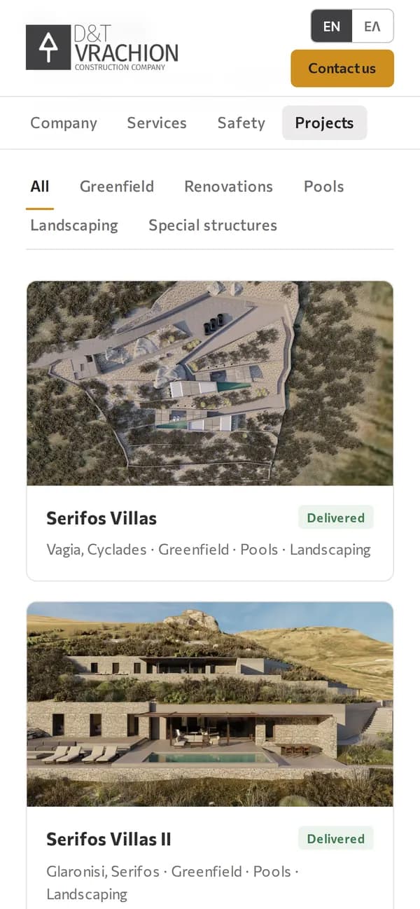
An engineering and construction company in Kifissia, Athens. We replaced their WordPress site with a bilingual website and a CMS the team edits itself. Projects, services and pages run in English and Greek, and every enquiry lands in one inbox.
Visit websitevrachion.com
At a glance
- languages
- 2
- English and Greek, on every page and in every CMS field
- project categories
- 5
- Greenfield, renovations, pools, landscaping and special structures
- FAQ sections
- 6
- One at the end of each main page, marked up for search
What we built
The public website
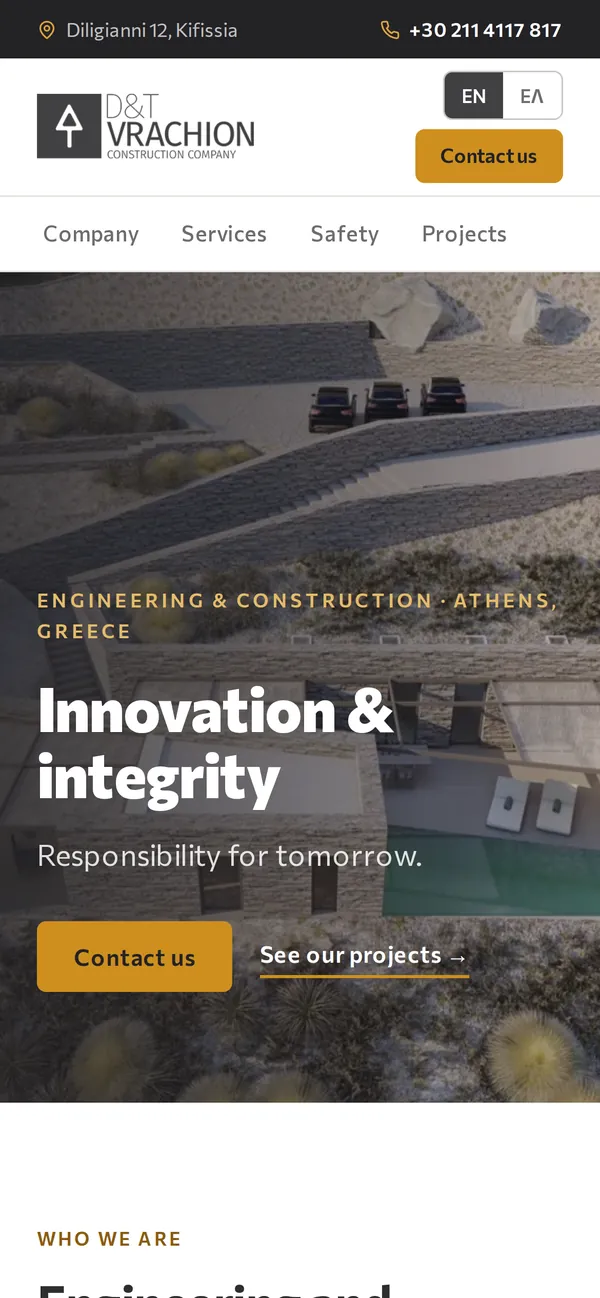
vrachion.com- English and Greek on every page, with a language switch that keeps you on the same page and a logo for each language.
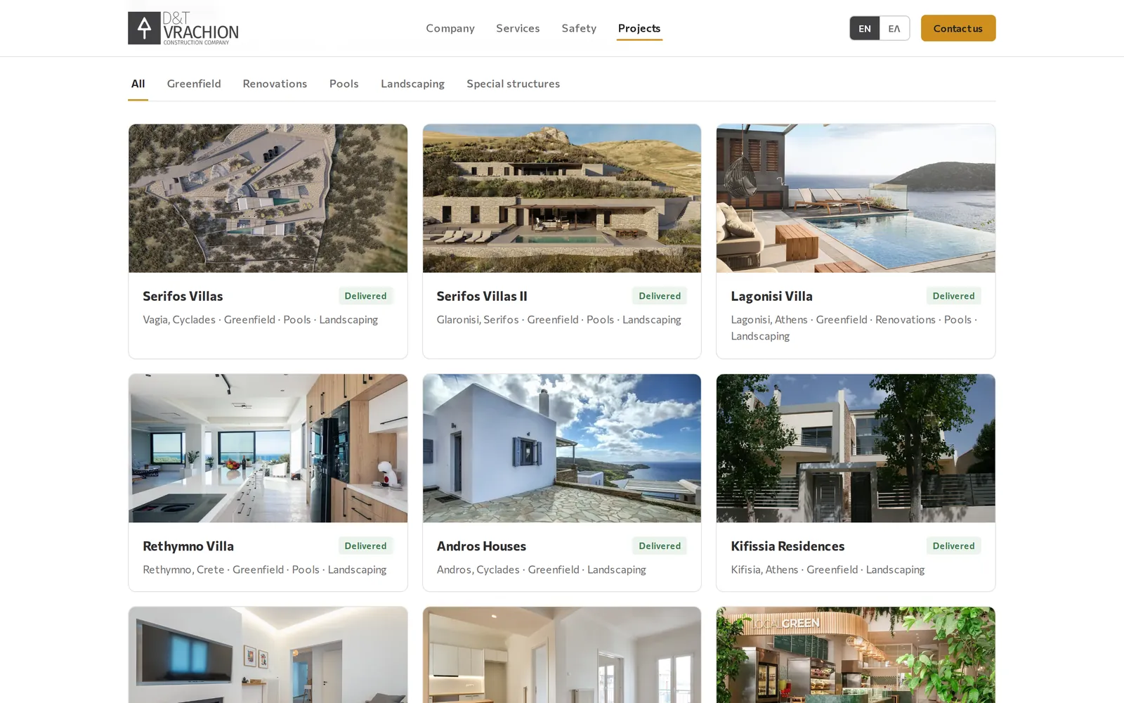
- A project catalogue with category tabs. A project can sit under several categories.
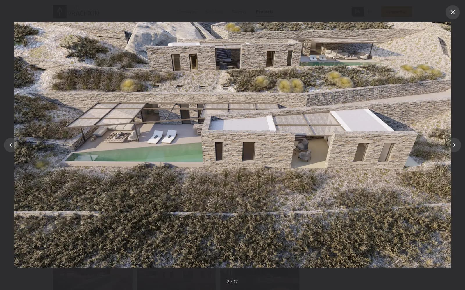
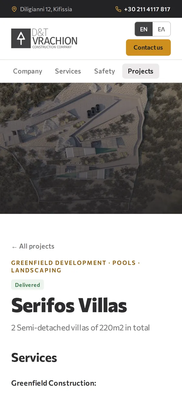
- A page per project with its categories, status and a fact card, then a full-screen gallery that works with arrows, keys or a swipe.
- Company, services and safety pages, each closing with a FAQ accordion marked up as FAQPage.
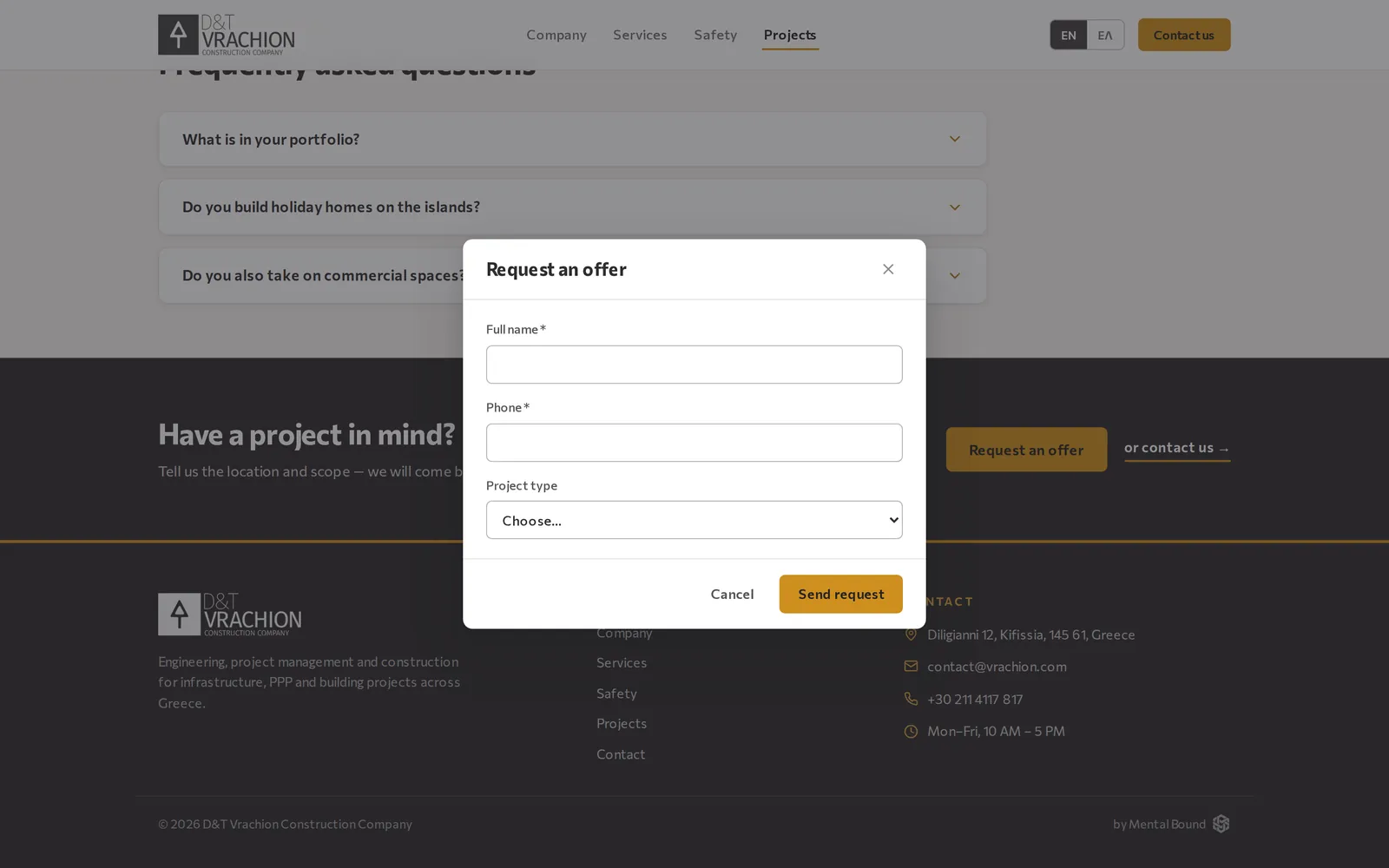
- A request-an-offer dialog that asks only for a name, a phone and the project type.
- A contact page with a form, tap-to-call and tap-to-email details, and a map of the office.
- A topbar with address, hours, email and phone, plus a bilingual sitemap and an llms.txt built from the CMS content.
- Redirects from the old site's tag and listing URLs, and bot and spam protection on both forms.
The CMS behind it
Admins only- Pages, projects, services and categories, with every field editable in English and Greek.
- Project galleries: upload, reorder, and tick the categories a project belongs to.
- Markdown editing with a live preview.
- Draft or published for every page, service and project. A save updates the live site straight away.
- One inbox for contact messages and offer requests, marked read or unread, with the latest on the dashboard.
- Site settings for company details, hours and the map link in both languages, and a switch for the topbar.
From a project in the CMS to an offer request
CMS
Edit
An admin adds a project in both languages, ticks its categories and uploads the gallery.
CMS → website
Publish
Saving a published project updates the live pages at once. Drafts stay hidden.
Website
Browse
Visitors filter the catalogue by category, then open a project page and its gallery.
Website → CMS
Request
The offer dialog takes a name, a phone and the project type. The request lands in the CMS inbox and in the office's email.
Screens
vrachion.com/projects
vrachion.com/projects/serifos-villas
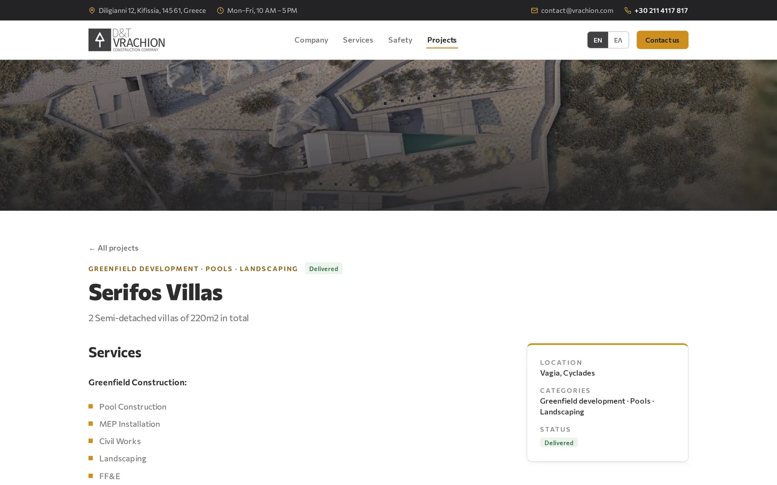
vrachion.com/projects/serifos-villas
vrachion.com/projects
Built with
- Next.js
- React
- TypeScript
- Tailwind CSS
- Supabase (PostgreSQL)
- Vercel
Ready to get started?
Tell us about your goals — we'll propose milestones within 48 hours.