 Mental Bound
Oasis Development — Greek real estate platform
An Athens agency that sells and rents property to Greek and international buyers. We built two connected apps: the public website, in five languages, and the CRM the team runs it from. Listings go out from the CRM, and inquiries come back into it.
Visit website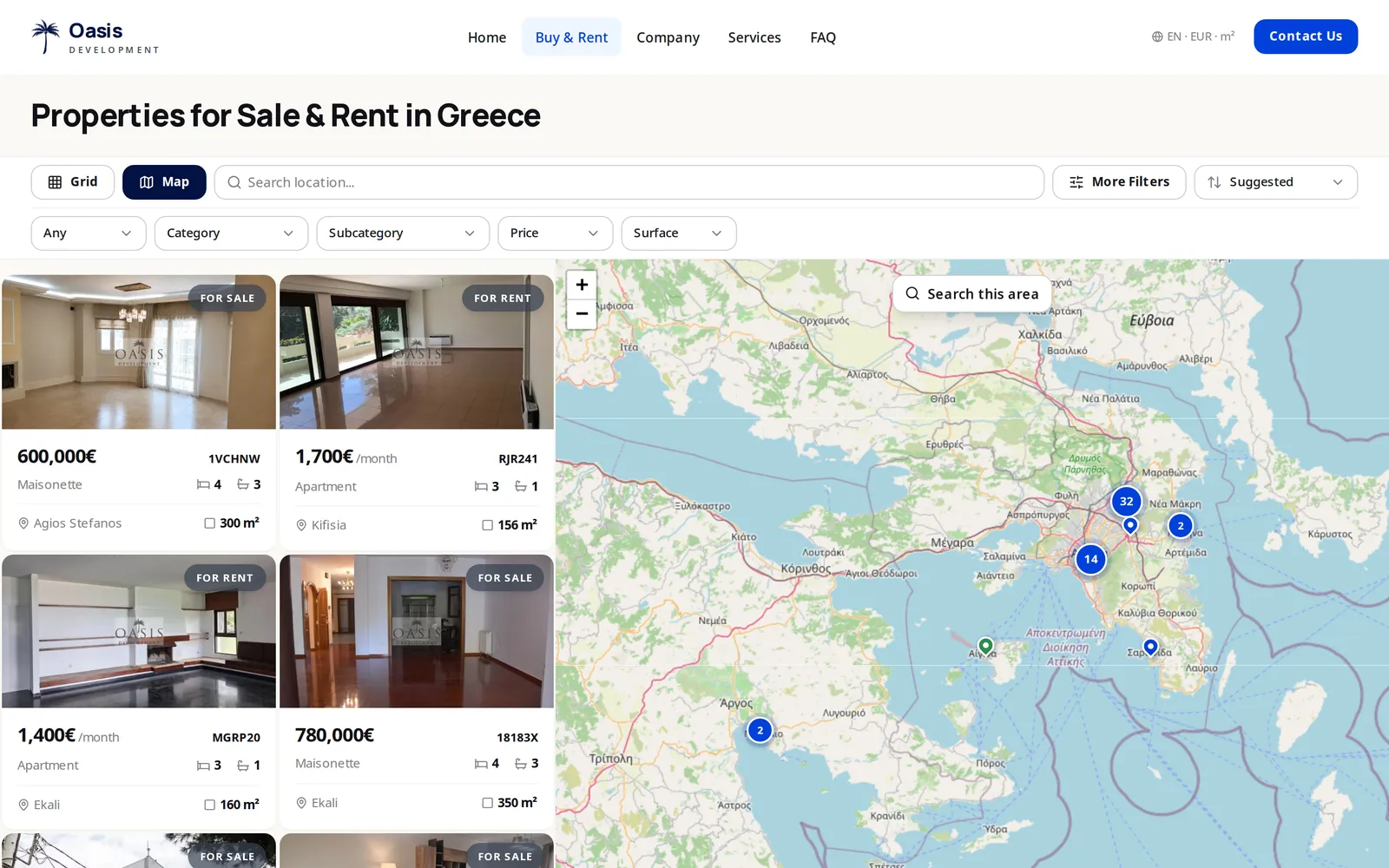
At a glance
- languages
- 5
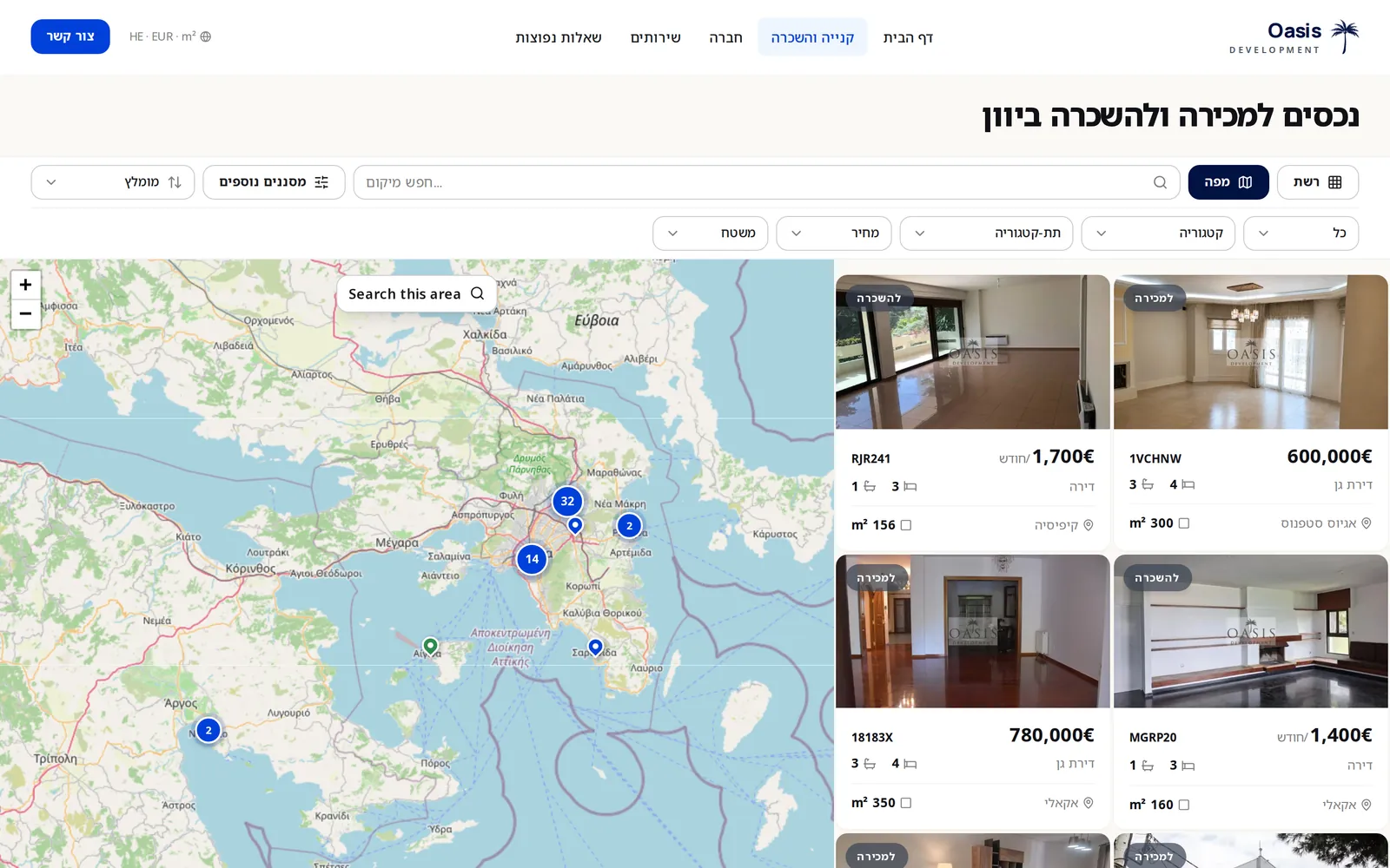
- English, Greek, German, Chinese and Hebrew, which reads right to left
- connected apps
- 2
- The public website and the agency's CRM
- amenity filters
- 30+
- On top of price, surface, floor, heating and land details
- listing code
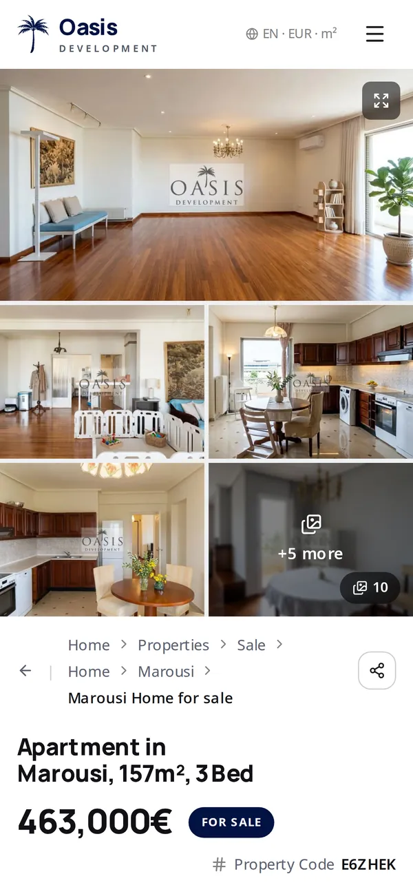
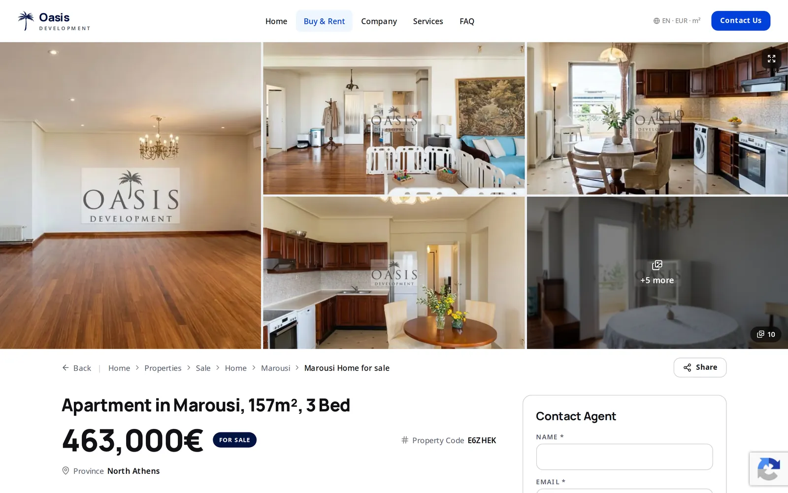
- E6ZHEK
- Six characters, on the card, in the URL and in the inquiry
What we built
The public website
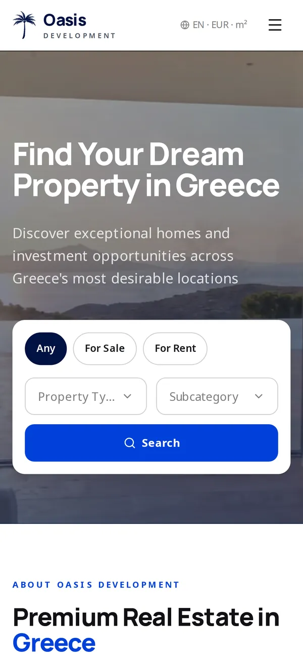
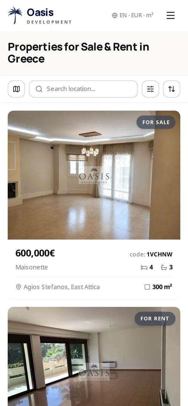
oasisdevelopment.gr- Map and grid search that stay in sync. “Search this area” searches the part of the map in view.
- Filters for sale or rent, category, price and surface, plus 30+ amenity, floor, heating and land filters.
- A readable URL for every listing in every language:
/en/properties/sale/home/marousi/e6zhek. - Listing pages with a photo gallery, the area on a map, and an inquiry form that already knows the listing.
- Hebrew mirrors right to left from the same layout. Prices show in EUR, USD or GBP, surfaces in m² or sq ft.
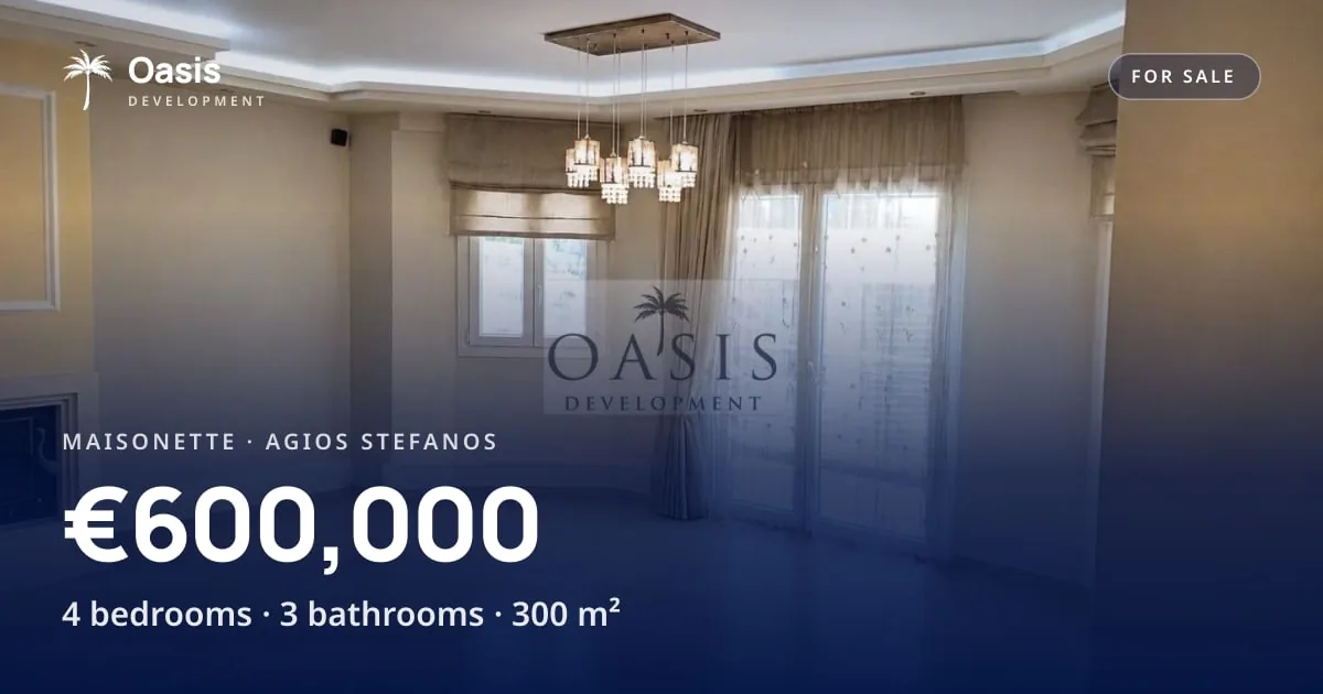
- A share image generated for each listing in each language, and short links by code:
/p/e6zhek. - Structured data on every listing, hreflang across the five languages, a sitemap and an llms.txt.
- Spam protection on every form, a newsletter that records consent, and nightly backups.
The CRM behind it
Internal, invite-only- A listings editor. Photos are resized and watermarked on upload; the exact address and private notes never leave the CRM.
- Publishing per listing, with a compare view of what changed since the last publish.
- Translations into the other four languages: a machine draft the team edits, with a spell check.
- Leads as a list or a drag-and-drop pipeline, with tags, owners and an activity timeline.
- Buyer requests: what each lead is looking for, matched against the listings.
- An inbox inside the CRM: threads, drafts, attachments, and listing cards in outgoing mail.
- Tracked links in that mail, and a visitor view of which listings draw attention in which language.
- Meetings, tasks and a shared calendar, and edit locks so two agents never overwrite each other.
From listing to lead
CRM
List
An agent enters the listing, its photos and the exact address.
CRM → website
Publish
One action copies the public part. The map pin moves a few hundred metres off the address, photos turn into WebP, translations go along.
Website
Discover
Buyers search by map or grid in their language and land on a listing with its own URL and code.
Website → CRM
Inquire
The form already knows the listing. The message arrives in the CRM as a lead, matched by email to any contact the agency already has.
Agents reply from the CRM inbox, with listing cards and tracked links.
Screens
Built with
- Next.js
- React
- TypeScript
- Tailwind CSS
- Supabase (PostgreSQL)
- Leaflet
- Vercel
Ready to get started?
Tell us about your goals — we'll propose milestones within 48 hours.